
You spent hours choosing the perfect font. But can your users tell the difference between a one, a lowercase l, and an uppercase L? If not, your beautiful typography may be getting in the way of communication.
We Choose Fonts for the Wrong Reasons
How do you choose a font?
Most people start by typing a few words into a font preview tool and scrolling through the results. They look at a sentence like "The quick brown fox jumps over the lazy dog" or perhaps a block of Lorem Ipsum text. Then they make a judgement based on how the font feels. Is it modern? Professional? Elegant? Friendly? Serious?
There's nothing wrong with that. The visual personality of a font matters. Typography plays a huge role in branding and communication.
The problem is that many people stop there.
When choosing a font, I am far less interested in how it looks in a carefully crafted sample sentence than I am in how it behaves when people actually have to read it. Not read it casually, but read it accurately. Those are two very different things.
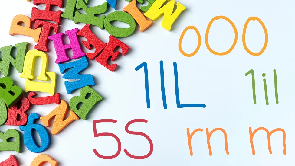
The Three-Character Test
One of the first things I do when evaluating a font is type three characters:
1lL
That's the number one, a lowercase l, and an uppercase L.
Can you tell them apart immediately?
If you have to pause, zoom in, or look twice, then the font has already failed one of the most basic readability tests.
The same applies to other commonly confused characters. How clearly can you distinguish between a zero and the letter O? What about an uppercase I, a lowercase l, and a vertical bar? Does the combination of "rn" look suspiciously like the letter "m"? Can you easily tell the difference between a 5 and an S, or an 8 and a B?
These are not obscure edge cases. They occur constantly in everyday life. We encounter them in passwords, licence keys, tracking numbers, URLs, email addresses, serial numbers, and countless other places where accuracy matters.
Yet most font previews never show them.
Instead, we are shown beautiful marketing samples containing carefully selected words that make every font look attractive. Those samples are designed to sell the font, not to test its usability.
Why We Miss the Problem
Part of the problem is that our brains are remarkably good at filling in gaps. When reading normal text we rarely examine individual letters. We recognise entire words and patterns. Even when letters are missing or slightly distorted, most people can still understand what they are reading.
That ability works against us when evaluating fonts.
When a designer looks at a headline, they already know what it says. Their brain automatically corrects ambiguities and fills in details. The user seeing the text for the first time doesn't have that advantage.
Imagine receiving a password from a support desk. Imagine trying to enter a licence key printed on a document. Imagine copying an API token from a web page. In those situations you are not reading words. You are reading individual characters, and every character matters.
A font that looks beautiful in a heading can suddenly become frustrating when used for those tasks.
Developers Learned This Lesson Long Ago
This is one of the reasons why developers often obsess over typography in ways that designers sometimes find excessive. Programming fonts have spent decades solving these problems. Many include a slashed zero, a distinctive lowercase l, or a more obvious uppercase I. Some go even further by making every potentially confusing character visually unique.
These features are rarely added because they look attractive. They are added because they prevent mistakes.
The people designing those fonts understand a simple truth: clarity is more important than style.
Readability Is an Accessibility Issue
This also has implications for accessibility.
When accessibility is discussed, typography often takes a back seat to topics such as colour contrast, keyboard navigation, and screen reader support. All of those are important, but readability is part of accessibility too.
A font can meet every technical accessibility requirement and still make life unnecessarily difficult for people. If users struggle to identify characters correctly, the design is creating a barrier. It may not be a barrier that shows up in an automated test report, but it is a barrier nonetheless.
Accessibility is not only about whether people can see content. It is also about whether they can understand it accurately.
Yes, This Site's Font Fails
When Branding Gets in the Way
The irony is that organisations will spend enormous amounts of time debating colours, logos, and brand guidelines while paying very little attention to whether their chosen typeface is actually easy to read. A font is often selected because it feels premium, sophisticated, or distinctive. Those qualities may help define a brand, but they should never come at the expense of clarity.
After all, the primary purpose of text is communication.
A Better Way to Choose a Font
The next time you find yourself choosing a font, spend less time looking at marketing samples and more time examining the details. Type out some awkward character combinations. Look at URLs. Look at reference numbers. Look at passwords and email addresses. Try to find the characters that people commonly confuse and see how the font handles them.
You may be surprised by the results.
A font's job is not simply to look good on a design mock-up. Its job is to communicate information clearly and accurately. If people cannot easily tell the difference between a one, a lowercase l, and an uppercase L, then it doesn't matter how beautiful the font looks.
Because at that point, the font is getting in the way of the message.


 Congratulations, you discovered a hidden secret!