One of the strengths of Joomla is it's template system but this is also one of it's weaknesess. More and more the tendency for designers is to showcase as many different cool things as possible that they can achieve in a Joomla template rather than concentrate on presenting the site owner's content.
Personally I always consider the SCOPE of the template before selecting it
- Suitability
- Creativity
- Originality
- Performance
- Expandibility
Depending on your needs, requirements and skills the amount of weighting you apply to each of these criteria may vary considerably.
I apply a much higher value on a templates performance and expandability than I do to the creativity. Perhaps this is because when I am looking at templates for a prospective site I always find I am more attracted to those templates that are crisp and clean than those that are busy with a thousand modules on the front page.
I'm not sure exactly why but I think it's because I am a firm believer that the visitor to the site should be able to quickly and easily find the content that they want and that it should be easy on the eye.
When someone visits a site I have built, I don't want the first thing they think of to be "oh that is pretty" or "ooh look at that slide show". I want them to find the information that they came to the site for in the first place. The "pretty" bits should be there to let the site visitor find the content and not to distract them from the content.
The easier it is for them to find what they want the more they will use the site.
This doesn't mean that the design should be limited in what it can do. It just means that concentrating on presenting the content and not building a "Frankensite" with every module and plugin that looked good in the demo is the most important thing for me.
In an ideal world I would have the skills to build all my templates from scratch, but I neither have the skills or time for that. So instead I would like to have one template that I can use on ALL the sites that I build. Now you're saying but they will all look the same. But in my ideal world they won't and this is why.
My dream template will be nothing more than a framework to build upon.
It should have a gazillion template positions available to me. This is not so that I can search the Joomla Extensions Directory to find a module to fill the position but rather so that I have the opportunity to build the template for the site to my specifications and not to some other designers ideas of what will look good.
But as I have limited css skills I need to be able to switch these positions on or off and for them to just work. I don't want to have to start tweaking the css or html to make them behave as I want they should just do it.
- I should be able to select the font stack used and the base font size on the site at a flick of a switch
- I should be able to select the basic colour theme for the site at a flick of a switch
Recently several of the joomla template designers have been building systems that attempt to satisfy my needs and make me a happy boy but whilst they might have offered the power and flexibility that I demand there is a price to pay. Not a monetary price, as whatever they charge is worth it compared to my time, but the price I have to pay is the time to learn how to use it.
Today I think I may have found the "best joomla template" in the world, at least in my opinion of you value it. It offers the flexibility that I demand AND I don't need to struggle for days working out how to use it.
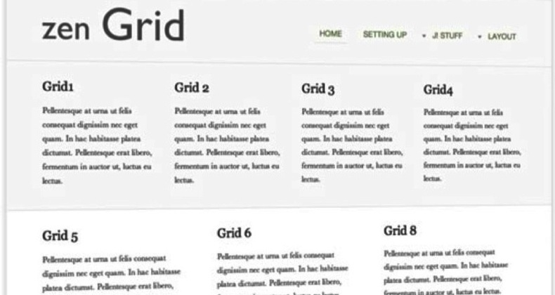
Zen Grid from JoomlaBamboo is just that template.
... takes the core features of the flexible 960 Grid system and ports it to Joomla inside an elegant, easy to use template scaffold that gives you complete control over all aspects of layout and styling. Zen grid is the perfect starting point for developing your own Joomla template.
By using simple configuration options and sensible default behaviours it is now easy for me to build sites that are each unique and yet each use the same template. The clean style concentrates on presenting the content in a clear and readable format rather than detract from it with flashy eye candy.


