

Joomla 5.2 quietly introduced a powerful new content feature: native accordions in TinyMCE, powered by standard HTML rather than JavaScript. This gives content creators an easy way to add collapsible sections while keeping markup clean, accessible, and future-proof.
Instead of relying on JavaScript-heavy accordion widgets, Joomla now embraces the browser’s built-in disclosure elements: <details> and <summary>. This small shift has big implications for accessibility, performance, and maintainability and it integrates beautifully with Joomla’s Bootstrap-based templates.
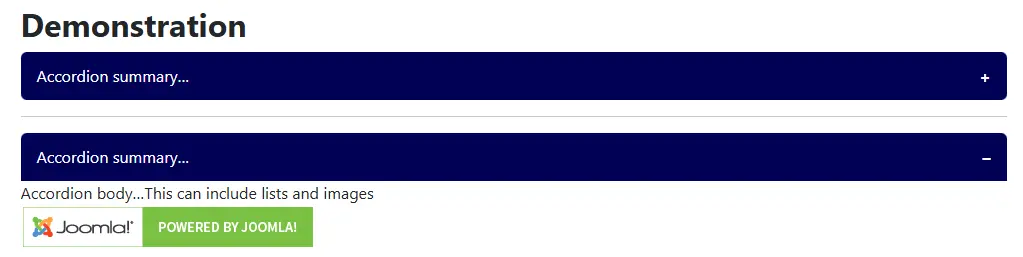
The TinyMCE Accordion in Joomla
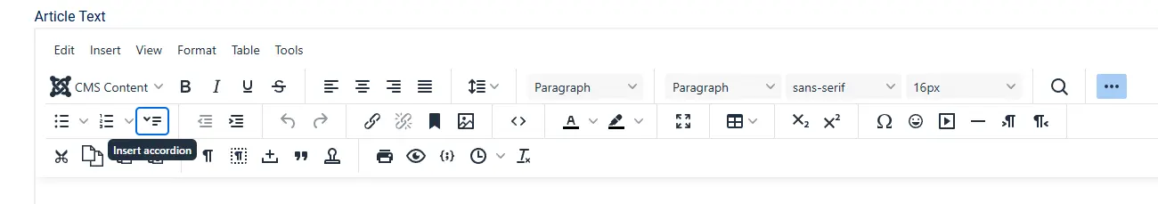
The workflow is simple:
- Open an article or custom HTML field using TinyMCE.
- Enter a heading or line of text.
- Select the text and click the Accordion button.
- Add content beneath the heading.
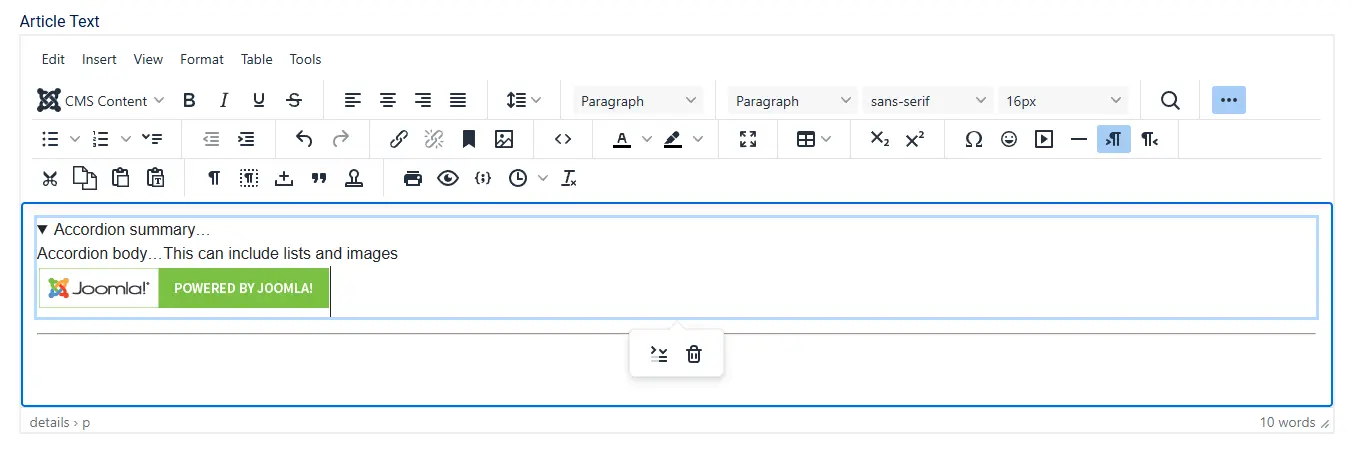
Under the hood, TinyMCE outputs standard HTML:
<details>
  <summary>Section heading</summary>
  <p>Your content here — text, images, lists, etc.</p>
</details>
There is no proprietary markup, no JavaScript dependency, and no Joomla-specific syntax. What you see is what the browser understands natively.
Open or Closed by Default
After creating an accordion in TinyMCE, you can control whether it is expanded or collapsed when the page first loads.
Select the accordion summary and click the Toggle Accordion button in the editor toolbar. This action adds or removes the open attribute on the <details> element.
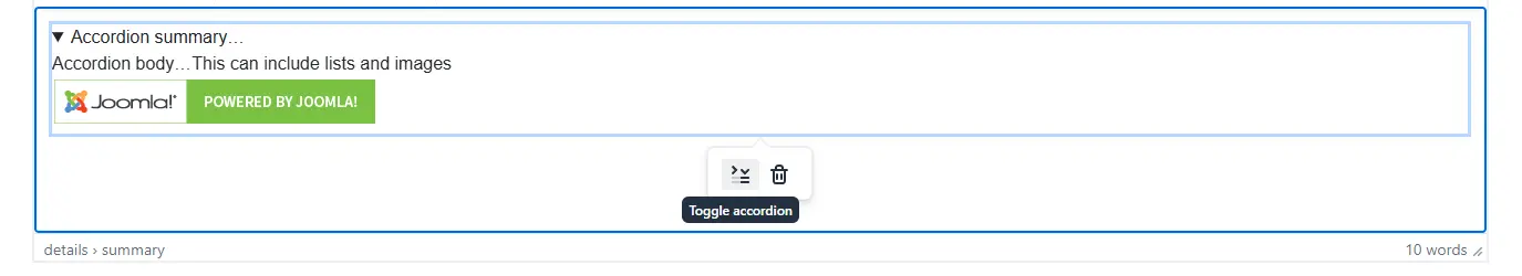
When the attribute is present:
<details open="open">
the accordion is displayed open by default.
When it is removed:
<details>
the accordion loads closed, requiring user interaction to reveal its contents.
Because this behaviour is controlled entirely by native HTML, it works consistently across browsers and remains fully accessible — with no JavaScript required.
Powered by Native HTML: <details> and <summary>
The accordion feature relies on standard HTML disclosure elements:
<details>defines a collapsible container<summary>provides the visible toggle
These elements are part of the HTML specification and are supported by all modern browsers.
Why this matters
- Built-in interaction: Clicking the summary automatically opens and closes the panel.
- Keyboard support by default: Users can toggle the accordion using Enter or Space.
- Semantic meaning: Screen readers recognise the relationship and announce state changes.
- No JavaScript required: The browser handles everything.
This is accessibility done the right way — intrinsic to the markup, not bolted on afterwards.
Accessibility Without Extra Work
Traditional accordions often require JavaScript plus carefully managed ARIA attributes to be usable by keyboard and assistive technology users.
With <details> and <summary>:
- The open and closed state is automatically exposed
- Focus behaviour is correct by default
- Screen readers announce the control properly
There is no need to add aria-expanded, role="button", or custom keyboard handling. Joomla’s TinyMCE accordion is accessible out of the box.
This works anywhere Joomla renders HTML — articles, modules, and custom fields.
Styling Accordions with CSS
Browsers apply minimal default styling to disclosure elements. CSS is where the real power lies and Joomla’s Bootstrap integration eg with Cassiopeia makes this especially elegant.
Button-style Summary Headings
summary {
  display: flex;
  justify-content: space-between;
  align-items: center;
  background-color: var(--primary);
  color: var(--white);
  padding: .75rem 1rem;
  border-radius: .375rem;
}

details[open] summary {
  border-bottom-left-radius: 0;
  border-bottom-right-radius: 0;
}
Add a simple open/close indicator:
summary::after {
  content: "+";
  font-weight: bold;
}

details[open] summary::after {
  content: "–";
}
Removing the Default Browser Marker
summary::-webkit-details-marker {
  display: none;
}

summary {
  list-style: none;
}
Joomla Overrides and Integration Strategy
The key advantage of this approach is that you do not need to override TinyMCE output. Instead:
- Add CSS to your template’s custom stylesheet
- Scope styles if needed (for example
.article-content details) - Use Bootstrap CSS variables for long-term compatibility
If you do choose to create layout overrides, keep the <details> and <summary> structure intact. Replacing them with generic <div> markup means rebuilding accessibility from scratch.
Creative Use Cases
- FAQs and help documentation
- Long articles with optional deep-dive sections
- Code examples or configuration instructions
- Mobile-friendly content layouts
A Better Accordion by Default
The TinyMCE accordion in Joomla is a quiet but important improvement:
- Native HTML, not custom widgets
- Accessible by default
- Zero JavaScript dependency
- Fully styleable with CSS
- Seamlessly integrated with Bootstrap templates
This is Joomla choosing standards, accessibility, and maintainability over complexity and giving site builders more power with less code.
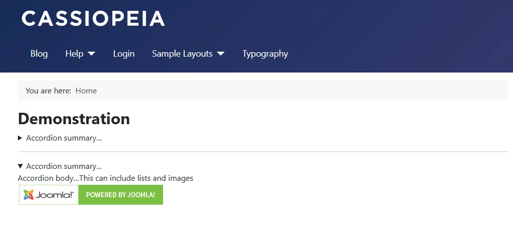


 Congratulations, you discovered a hidden secret!