

To make a powerful application such as Joomla understandable is not an easy task. It is something that I think we have done a reasonable job with over the years but there is always room for improvement.
Consistency, Clarity, Concise
Users of Joomla before version 3 will remember that every extension you installed would try to re-invent the user interface. Thankfully most don't do that anymore and each extension has the same look and feel as each other. This massively improves both usability and the ability for a user to understand what they need to do to achieve a task and what to expect when they press a button.
Too many options
It seems that whatever we do to try and simplify and remove options always fails as everyone wants to use Joomla differently. But what we can do and have tried to achieve with Joomla 4 is to avoid over-communication.
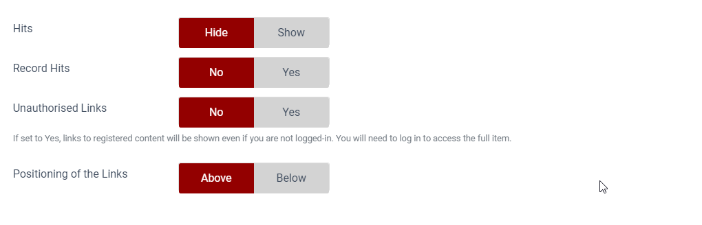
An area of Joomla that I have wanted to change for a long time is the usage of tooltips. In Joomla 3 we got it completely wrong. Bootstrap didn't provide any indicator that a label had a tooltip. So instead of writing an indicator ourselves we adopted the principle of giving everything a tooltip. Have you ever read them? Most of them are simply crazy and just explain the obvious.
In this video you can see that with these article options not a single one of the tooltips said anything useful. Did I really need to get the extra information that a button labelled "Show Author" would display the name of the author? Did it add anything? Did the sheer volume of information scare a user and make them think Joomla was overly complex and too hard to use. Finally we know from bug reports that the information was not being read where it was important. Probably because the user had become "useless tooltip blind".
It is also important to point out that not one of the tooltips was accessible to a non mouse user, even if you used the alternative "accessible" admin template Hathor.
Delete them all!!
Well not quite but almost. This was a mammoth task. It started by changing the code so that the tooltip was now displayed on the page. Then I reviewed every single one of those tooltips and removed any that were not useful. Guess what? As a result over three thousand strings were removed. That's also three thousand less lines that the translation teams have to translate, a massive saving in their time.
Where a tooltip is useful it is now displayed on the page so that everyone can read it. Often it has been considerably edited as some "tips" were complete manuals.
Less is More
On the web, or a computer screen, scanning is the norm and too much information weakens the effectiveness of the message - it does not enhance it.
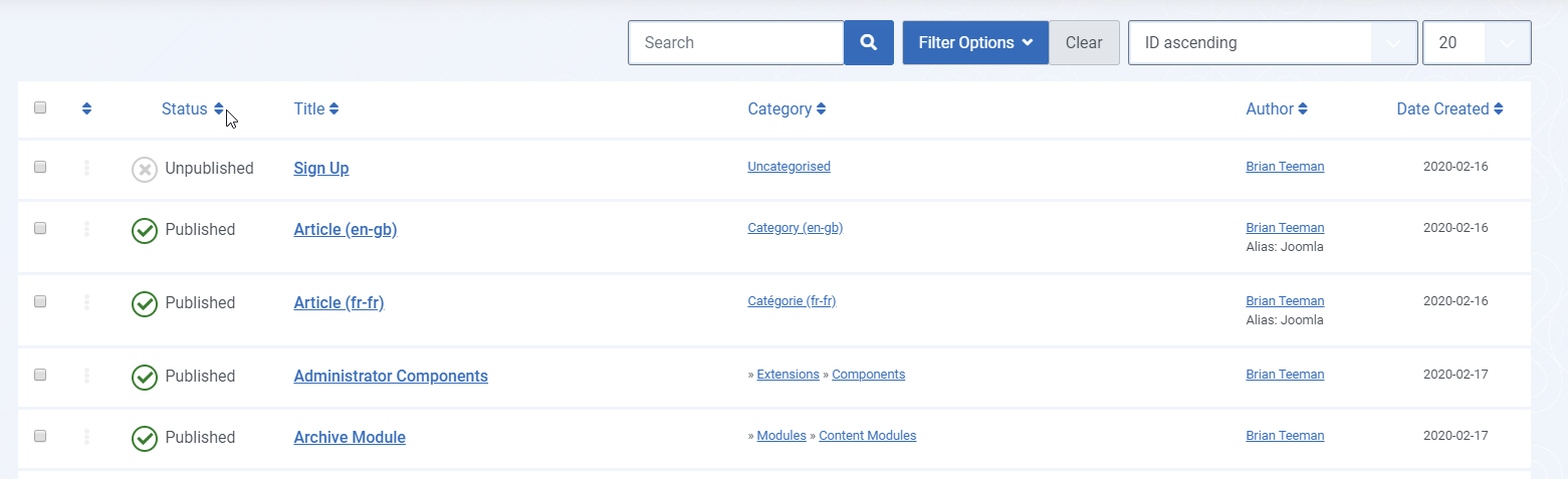
Some of the list views in the admin are displaying so much that you just can't find anything. 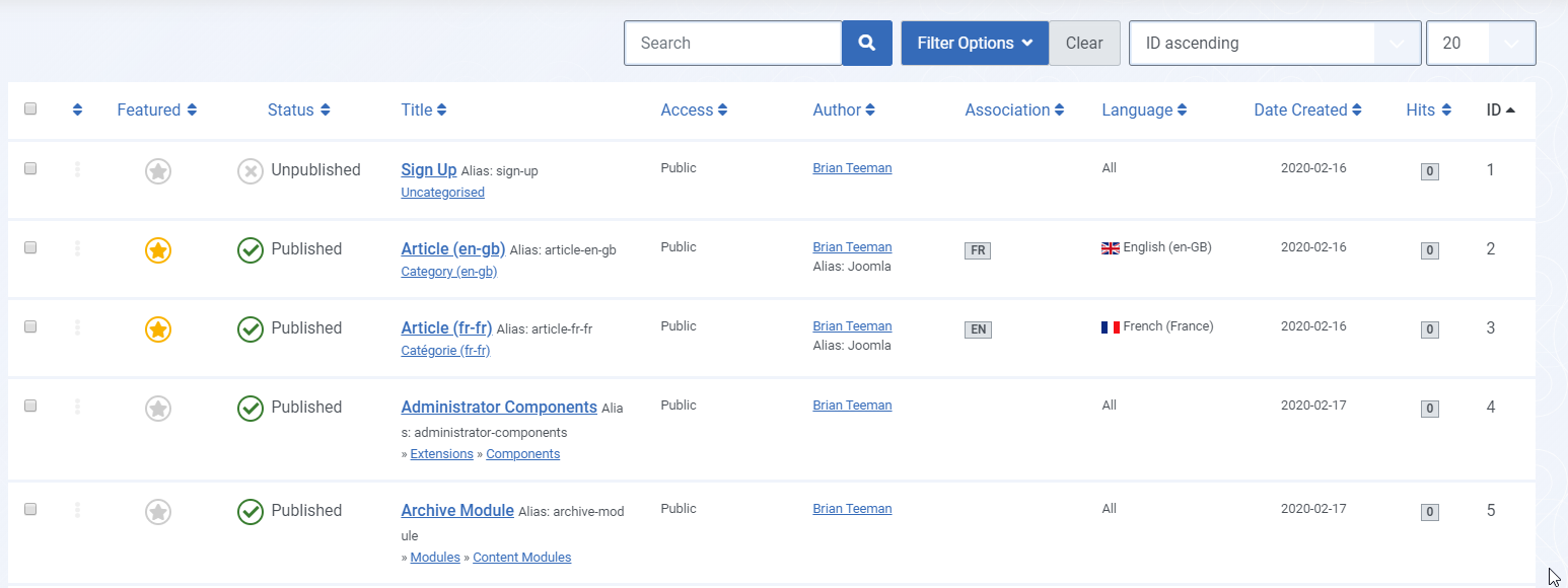
But what to remove? If your site is only in a single language we already hide the language and associations columns. Do you need to display the name of the author if there is only one? Do you need to display the date if it is never used? Do you need to display the access level if your site has no log in?
The concept of simple and advanced interfaces has been talked about many times before but it never really works. Each site is too personal and if you need to display a column that is not in the simple interface you should not have to display everything just for one column. There is no one size fits all solution here. It's subjective and not necessarily based on something that we can determine programmatically.
Currently I am experimenting with the ability for the site owner, and perhaps each admin user, to be able to select which columns to display for every component. There will be a "sensible" basic default which you can easily customise if you wish to.
Progressive Disclosure and Sensible Defaults
This technique has also been used in other areas. Joomla 3 gave you the option to completely customise the buttons on the wysiwyg toolbar. I wonder how many people did that or just stuck with the default. As the default was to include everything the editor ended up with more buttons than a full word processor.
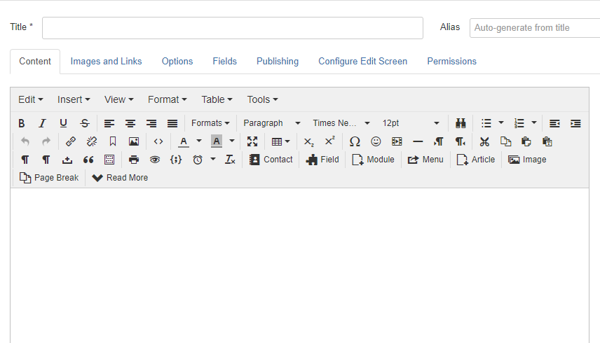
With Joomla 4 we have kept the editor customisation feature but have taken advantage of a new feature in the editor. The editor will now only display the first row of buttons until you click on the magic drawer to reveal the rest. This is great for those who don't want to customise the toolbar AND for those who want to keep all, or a large set, of buttons but want to "hide them away" until they occasionally need them.
Accessible Joomla 4 - Part 3
Tomorrow I will take a closer look at some of the less visible changes for forms and lists.


 Congratulations, you discovered a hidden secret!