Back in November I published a blog post "Where is the search?" in which I stated that the search button should be at the top right hand corner of your web site because "everyone else puts it there so that's where your user expects to look."
According to a recent survey of the Top 100 blogs at Technorati by Smashing Magazine 62% of sites have the search box in the top right corner of the site, just like here, with the majority of the rest placing it at the top of the right hand sidebar.
Today I found another reason.
WebAIM the leading web site accessibility resource recently published the results of a survey into the usage of screen readers.
Over the last few years I've gradually been experiencing how users who read web sites with assistive technologies, such as screen readers, use a site. Perhaps the biggest lesson I have learnt is that no matter how much I test a site with these assistive technologies it is no substitute to the real world experience of someone who uses them every day.
What I found particularly interesting from the survey was that blind users look for a search button just as often as sighted users but in different ways. Instead of relying on the "norm" of the top right they rely on other "norms" such as the "search" being the first text/edit field or form element on the page.
I've extracted the two relevant sections below that refer specifically to searching a web site.
Search

| Response | % of Respondents |
|---|---|
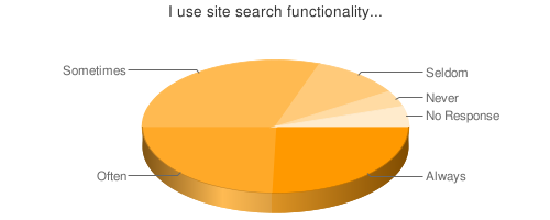
| Whenever it's available | 26% |
| Often | 25% |
| Sometimes | 31% |
| Seldom | 11% |
| Never | 4% |
| No Response | 5% |
Over half of the respondent always or often use search when it's available. This emphasizes the importance of not only providing search functionality, but providing it in an easy-to-find and use manner.
Locating Search

| Response | % of Respondents |
|---|---|
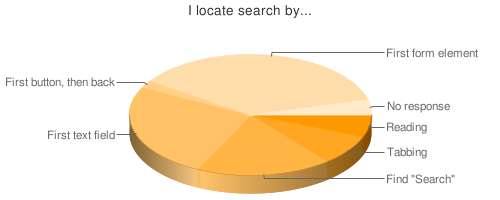
| Read through the page content until the search form is encountered | 6% |
| Tab through page elements until the search form is encountered | 8% |
| Find the word "Search" | 18% |
| Jump to the first text/edit field on the page | 25% |
| Jump to the first button on a page and go back one element | 2% |
| Jump to the first form element in a page | 36% |
| No response | 4% |
Respondents use a wide variety of techniques for finding the site search. Proficient screen reader users were more than twice as likely to jump directly to the form or text/edit field than less proficient users. Less proficient users were nearly three times more likely to use more manual methods (reading, tabbing, or finding) than more proficient users.


