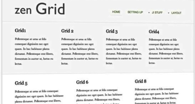
One of the strengths of Joomla is it's template system but this is also one of it's weaknesess. More and more the tendency for designers is to showcase as many different cool things as possible that they can achieve in a Joomla template rather than concentrate on presenting the site owner's content.
Sadly in the last 6 months there have been two published circumstances where an extension provider has been hacked and malicious code inserted into the extensions that they offer.
This meant that as soon as you installed the extension your site was vulnerable to defacement etc.
If there have been two published cases perhaps there have been more that we don't know about.
So is there anything we can do to prevent this?

On Wednesday I explained how your Joomla site might be exploited
"Just because you keep your server secure and your software up to date you may have been exploited yesterday, ready to be hacked tomorrow."
Today I read an article explaining the exact same thing happening on a Wordpress site. I had tried to explain this to the site owner 6 weeks earlier but...

..or how do you keep your Joomla web site secure?
I've sat on this blog post for a few weeks as I wanted to separate any connection to the specific client for who this relates to.
So I'm sat in a hotel bedroom, idling away the time before bed, browsing a news sites when a skype window pops up on my Mac.
"Please help!!!! I've got 12 sites all on different servers and they keep getting defaced."
Now obviously I then ran through my usual set of questions:
- "Are the sites running the latest version of Joomla?"
- "Are the file and directory permissions set sensibly?"
- "Do you monitor the extensions and make sure they are all up to date?"
And the answer was yes to all of the above.

Actually this article should really be titled "How NOT to make a Joomla template".
I've blogged in the past about using Joomla Template Clubs and software to create your own joomla template and I know many people like to design their own template from scratch.
But there is still a significant number of people who just take one of the three default Joomla templates and modify them to suit their needs.
If you are one of those people then this is especially at you.

You may have been lucky enough to have seen this presentation live in The Netherlands or Germany or even listened to it at slideshare but now you can watch the presentation in all it's glory.
Thanks to my cameraman Fotis Evangelou the entire presentation is now here for you to enjoy.
It's 31 minutes of pure entertainment - I hope you enjoy it as much as those who saw it live.

I was getting my mp3 player ready for my summer holiday today, yes a very late summer holiday, when I heard a favourite old song by Helen Reddy from the 70's.
Somehow it just seemed to be very appropriate if you change just one word.

Whilst I was travelling home from Joomla!Day Germany I started thinking about how long it was taking me and was the journey worthwhile. The answer was "not that long" and "yes definitely".
Then I started wondering if my journey was amongst the longest and I quickly realised that because I was flying and others even inside Germany were driving then it wasn't.
Can you tell where I'm going with this?

OK, I admit it it, I just don't get why you would want to integrate these two applications.
I just can't see where the benefits are.


