Well, look at that. Joomla has been officially recognised as a Digital Public Good. Yes, really. Apparently, the rest of the world has finally caught up with something the Joomla community has known for, oh… about two decades.
In a world overflowing with news, social media, and constant online chatter, it can be hard to focus on what truly matters. Eleanor Roosevelt’s famous quote reminds us where our attention is best spent and why it is especially relevant for open source communities like Joomla.

Do More With Core
Joomla’s built-in access control system is one of its strongest features.

(Hint: It’s Not the Person in the Hoodie on the Homepage)
There’s a line I’ve repeated so often I should probably have it printed on a mug:

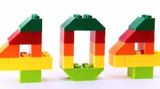
It happens to everyone. You click a link full of promise, only to land face-first in the dreaded “404 Not Found.” It’s like opening a door and finding a brick wall. For your visitors, it’s a frustrating dead end. For you, the site owner, it’s an opportunity.

But I’m Glad There’s a “U” in Volunteer
Communities thrive not because of teams, but because of you, the volunteers who make them happen.

Long blocks of text can be difficult to read, especially on a screen. Readers are more likely to stay engaged when text is broken up with images, spacing, or other design elements.

Great Scott! It's August 17th, 2025, and Joomla is turning 20! Time to fire up the DeLorean and take a wild ride through the spacetime continuum of open-source history…

From Star-Lord to CMS Superstar
You might think Hollywood heartthrob Chris Pratt and the open-source content management system Joomla have absolutely nothing in common. One blasts aliens across galaxies; the other powers websites across the internet. But hold onto your mixtapes, because the universe is smaller (and nerdier) than you think.


