
For a long time, I assumed alt text was only for people who are completely blind — people who couldn’t see an image at all and needed a full verbal replacement for what others could see. So when uploading a staff headshot on a contact form, I’d think, “What’s the point? It’s just a face.”
But accessibility is more complex than that. And vision isn’t simply all or nothing.
Vision isn’t binary. It’s not a clean divide between "can see" and "can't see." It’s more like a gradual transition between night and day. There are many states in between: twilight, dim light, blur, glare, and shadow. Some people can see shapes but not detail. Others have patchy vision or need high contrast to make sense of what they’re looking at. Some rely on screen readers occasionally, while also using magnifiers or large fonts.
Many people live somewhere along this spectrum. Their needs don’t fit neatly into one category. In these middle spaces, alt text becomes essential — not because someone can see nothing, but because they may not see everything, or may not see it clearly, consistently, or confidently. They might rely on screen readers for some tasks and magnifiers for others. They might see that there’s an image on a page but not well enough to interpret it or understand whether it has meaning.
That’s why alt text matters. It’s not just for those who are completely blind. It’s for anyone who can’t fully access an image’s content — whether due to low vision, cognitive processing differences, poor contrast, or even a slow connection where images don’t load.
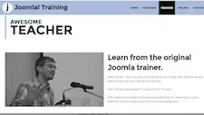
Take that headshot on a contact page. It might not need a lengthy or artistic description, but a simple phrase like “Photo of Alex Rivera, Customer Support Lead, a middle age man with blond hair” can provide helpful context. It makes the image meaningful, especially when visual clarity or layout design falls short.
When Decorative Images Confuse More Than They Help
Some images really are decorative and add no useful information. They’re borders, flourishes, or background shapes. In those cases, the correct approach is to use an empty alt attribute (alt=""). This tells screen readers to ignore the image so users don’t have to hear about purely visual fluff that adds no meaningful content.
The problem is that, in practice, this is rarely done well.
According to a WebAIM study of the top one million websites, around 18.5% of homepage images are missing alt text entirely. Many others include vague placeholders like “image” or file names. This means most sites aren’t using alt text — or decorative image markup — correctly.
Now imagine being someone with low vision. You might be able to see that there is an image on the page — perhaps a chart, a logo, or a person’s face — but your screen reader says nothing. The image has been marked as decorative, even though it appears to carry meaning. At that point, you’re left unsure. Is this an error in the code? Is it something you’re supposed to understand but can’t?
This uncertainty creates frustration. It also creates doubt and a sense of exclusion — not because the content is inaccessible, but because it's been marked in a way that hides it. You might hesitate to trust the site. You might even blame your own tools or limitations, when in fact the issue is poor markup.
The Emotional Cost of Uncertainty
Imagine seeing a blurry photo of two people shaking hands on a company’s “About” page. You can make out shapes — maybe even that it’s two adults — but the details are fuzzy. The screen reader is silent. Was this just a stock image to fill space? Or was this the CEO and a partner signing a major deal?
You don’t know. And that not knowing can feel like being shut out. It feels like a gap you’re not allowed to cross.
This is the human cost of incomplete or careless accessibility. When we design only for extremes — total blindness or full sight — we miss everyone in the middle. If we treat alt text as something only for people who are completely blind, we overlook the needs of a much larger group — those who live in the space between total vision and total blindness.
Better Alt Text Begins with Better Questions
Good alt text isn’t hard. It just starts with a shift in perspective:
- Ask yourself what someone would miss if the image didn’t appear.
- Use
alt=""only when an image truly adds no meaning or context. - Don’t assume people either see everything or nothing. Most people exist somewhere in between, and their experience depends on how you present information and how the content is coded.
Alt Text Is About Inclusion, Not Just Compliance
Alt text is a small detail, but it holds power. It tells someone, “You were considered. You’re included.”
It’s not just about meeting guidelines. It’s about making sure people aren’t left behind — or left wondering.
When we take the time to add meaningful alt text, we offer more than access. We offer clarity, confidence, and respect. We make sure no one is left guessing whether they missed something important.
Accessibility isn’t a checklist, and vision isn’t absolute. Both exist along a spectrum. A little extra care with something as small as alt text can make a big difference in how people feel when they visit your site.
Accessibility is never all or nothing. And neither is vision.