

In this tutorial I will be building on the full screen home page design that I demonstrated in Joomla home page with full screen image to create a more native app look to the template.
As before everything I am going to show here could have been done by creating my own template but as I wanted to ensure that it would be future proof I have done it with CSS and core Joomla functionality.
Caveat: I am not a front end developer so I am sure there are many other ways to achieve the same thing - this is just how I did it.
The objective
Create a more native app experience when viewing the website on a mobile device.
Part 1 - Moving the header to the bottom
Using a CSS media query we can write CSS that only applies to devices of a specific size. As the Bootstrap media queries for mobile devices kick in at a max-width of 768px we will be using the same sizes here.
With the Cassiopeia template you can create a file named user.css in the media/templates/site/cassiopeia/css folder and any CSS in that file will override existing CSS in the main template. This is a very convenient way to modify the template without any risk that your changes will be lost on an update. If you don't have one yet then create one.
We can now add the following CSS to that file to move the header to be visually displayed at the bottom of the screen and fixed in place so that it is always displayed.
@media (max-width: 768px) {
  .ishome .container-header,
  .container-header {
      position: fixed!important;
      top: auto;
      bottom: 0;
      width: 100%;
      padding: 0;
      background-color: #004177;
      background-image: unset;
  }
}
If you are adding this CSS to the CSS from the previous tutorial then you should set the background-color to the same as used there for the container-header if not then chose a solid dark colour.
If you are not adding this to the .ishome .container-header.
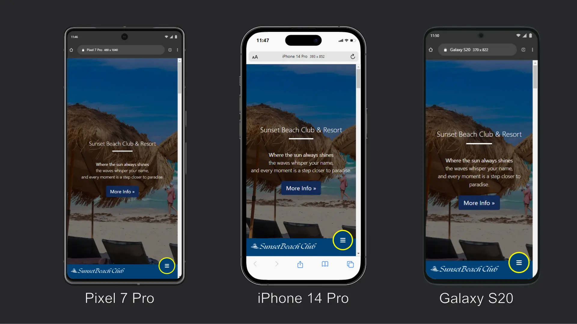
Result of Part 1
We have now moved the logo and menu toggler (hamburger) to the bottom of the screen.
Part 2 - Putting it all on one row
To give the native app look that I am looking for I am going to change the (hamburger) menu toggle so that it is fixed to the right of the screen and stands out from the background by adding a round border and positioning it so that it is partially clear of its background.
Adding the following CSS to the media query will do that.
.navbar-toggler {
    position: fixed;
    bottom: 20px;
    z-index: 9999;
    display: block;
    width: 70px;
    height: 70px;
    background: #004177;
    border: 4px solid yellow !important;
    border-radius: 40px;
    right: 10px;
  }
}
The background color should be set to the same color that you are using for the container-header and the border colour should be anything that will make it stand out. I chose yellow but you probably have a better eye for colour and will chose something else.
Depending on the size of your logo you may also need to set a max-width on the image as well by adding this additional CSS inside of the media query.
.container-header img {
max-width: 75%;
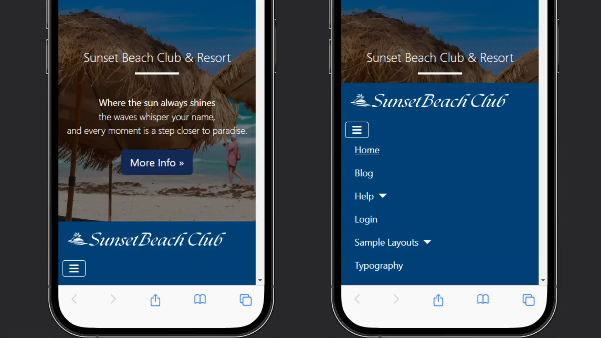
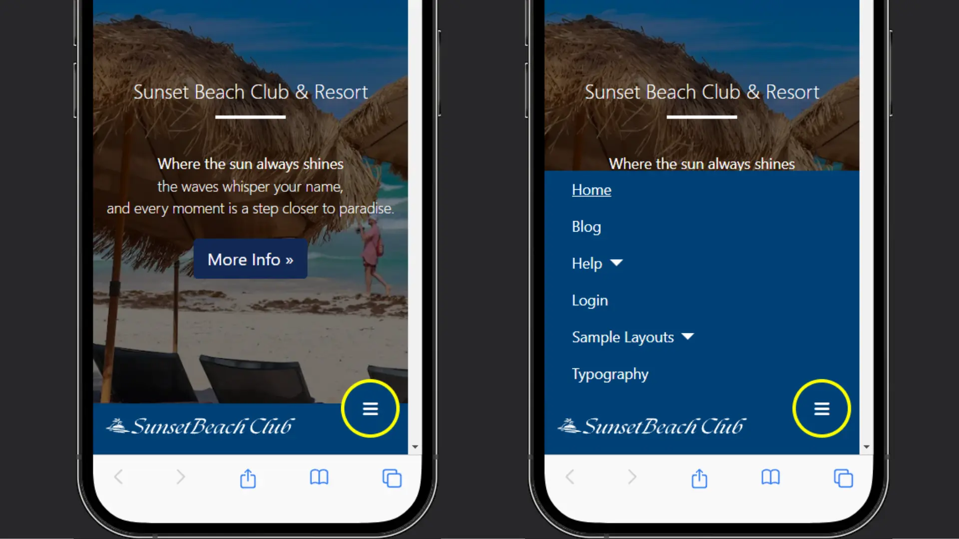
}Result of Part 3
The logo and menu toggler are now on the same line.
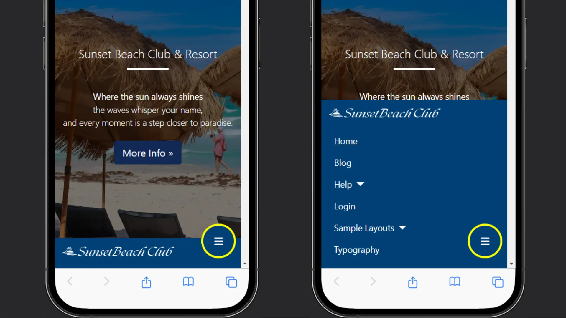
Part 3 - Expanding the menu from the left
To complete the native app experience we can change the way that the menu appears when it is toggled. Instead of scrolling up from the bottom with the site logo at the top of the menu I am going to keep the logo where it is and bring the menu in from the left.
Adding the following CSS to the media query will do that.
.navbar-collapse {
      position: fixed;
      bottom: 60px;
      left: 0;
      padding-left: 15px;
      padding-right: 15px;
      padding-bottom: 15px;
      width: 100%;
      background-color: #004177;
      height: auto;
      overflow: auto;
  }
  .navbar-collapse.collapsing {
    height: auto;
    transition: left 0.3s ease;
    left: -100%;
  }

  .navbar-collapse.show {
    left: 0;
    transition: left 0.3s ease-in;
  }
The background colour should be set to the same colour that you are using for the container-header.
Result of Part 3
The logo now stays at the bottom of the screen and the menu slides in from the left.
Final CSS
@media (max-width: 768px) {
  .ishome .container-header, /* only required if using the full screen image on the home page */
  .container-header {
      position: fixed!important;
      top: auto;
      bottom: 0;
      width: 100%;
      padding: 0;
      background-color: #004177;
      background-image: unset;
  }
 .navbar-collapse {
      position: fixed;
      bottom: 60px;
      left: 0;
      padding-left: 15px;
      padding-right: 15px;
      padding-bottom: 15px;
      width: 100%;
      background: #004177;
      height: auto;
      overflow: auto;
  }
  .navbar-collapse.collapsing {
    height: auto;
    transition: left 0.3s ease;
    left: -100%;
  }

  .navbar-collapse.show {
    left: 0;
    transition: left 0.3s ease-in;
  }
 .navbar-toggler {
    position: fixed;
    bottom: 20px;
    z-index: 9999;
    display: block;
    width: 70px;
    height: 70px;
    background-color: #004177;
    border: 4px solid #ffff00 !important;
    border-radius: 40px;
    right: 10px;
  }
  .container-header img {
    max-width: 75%;
  }
}
Menu Buttons
Next month I will show how you can add a row of buttons instead of the logo to take the native app styling even further.

 Congratulations, you discovered a hidden secret!